The Do’s and Don’ts of Mixing Drapery Colors in One Room
TLDR;
Mixing drapery colors in one room works best when you stick to a cohesive color palette, match undertones, and balance bold and neutral tones. Avoid clashing patterns, overusing multiple colors, and ignoring the room’s lighting or function. The right combinations will create harmony, enhance the space, and connect with your overall decor.
Why Drapery Color Mixing Matters
The colors of your drapery influence how a room feels and how the design flows. They can highlight architectural features, frame a view, and tie together furniture and decor. Poorly chosen combinations, on the other hand, can make a space feel disjointed. Simply Windows recommends treating drapery color as a key design element, not an afterthought.
When you choose colors carefully, you achieve:
- A cohesive and intentional look
- Visual balance that makes the space feel comfortable
- A connection between
window treatments and other design elements
Essential Color Principles for Drapery
Understanding core design principles will help you make confident decisions.
Understand Undertones and Complementary Contrasts
Colors have warm or cool undertones. Even neutrals like beige or gray carry them. Mixing warm and cool undertones often results in a mismatched feel. Complementary colors, which sit opposite each other on the color wheel, create strong contrast and work well for bold statements. Analogous colors, next to each other on the wheel, offer a softer, more unified look.
Psychological Effects of Color
Colors affect mood:
- Soft neutrals feel calm and relaxing
- Deep blues and greens feel grounding
- Warm reds, oranges, and yellows bring energy
- Blackout drapery in dark tones promotes restfulness in bedrooms
60–30–10 Rule for Color Balance
- 60%: Dominant room color (walls or largest elements)
- 30%: Secondary color (large furniture or drapery)
- 10%: Accent color (pillows, throws, accessories)
Following this prevents overloading a room with too many strong tones.
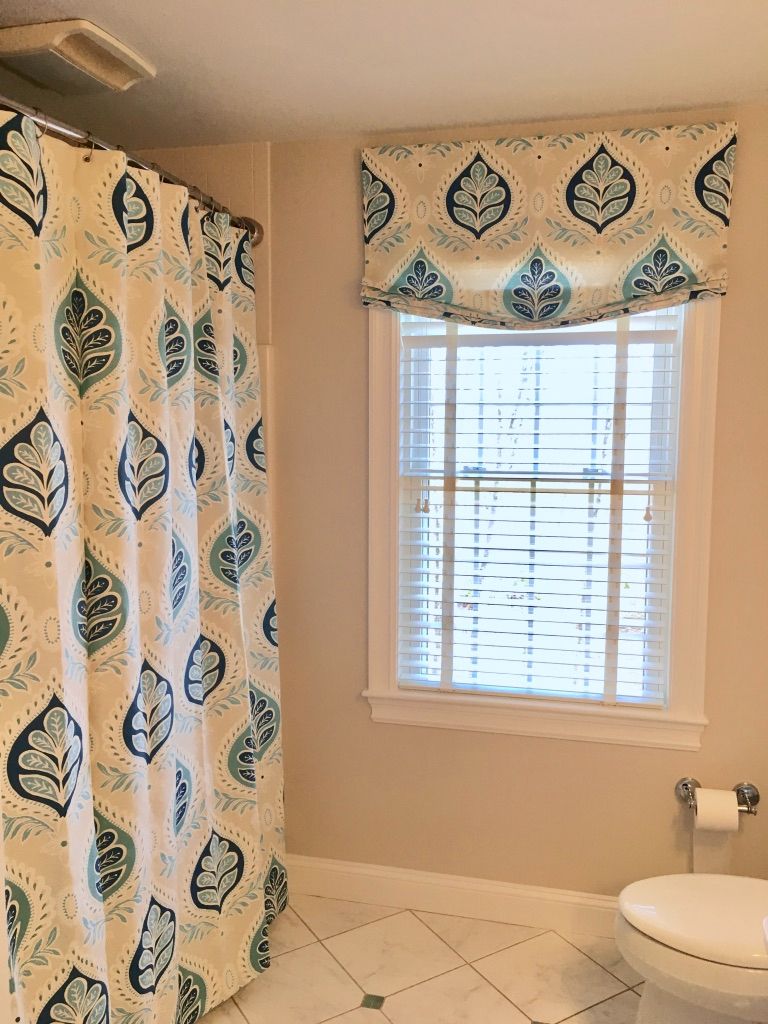
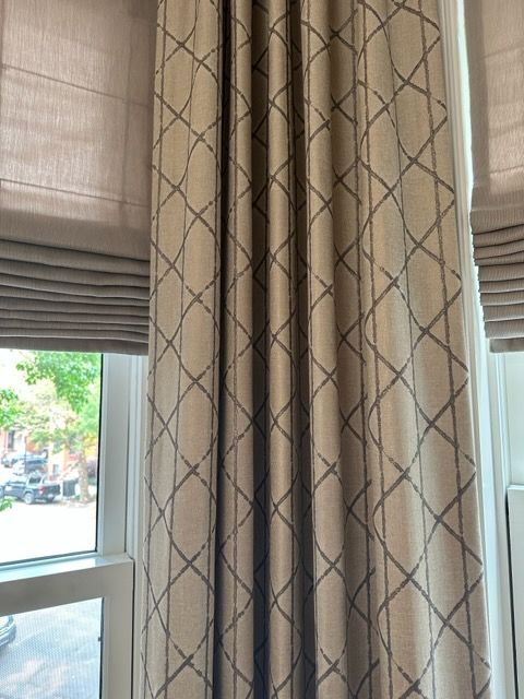
Layering Textures and Materials
Mixing sheers, blackout panels, velvet, and linen creates depth. The base layer provides functionality, while the outer layer adds color and style. Keep textures aligned with the room’s vibe; for example, linen works well in airy, coastal rooms, while velvet suits formal or dramatic spaces.
The Do’s of Mixing Drapery Colors
Start with a Cohesive Base Palette
Identify the main colors in your room before choosing drapery. Select one or two dominant tones and build around them.
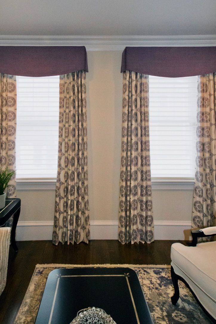
Use One Dominant Color and One Accent Color
Anchor your design with a main drapery color, then use a second color for contrast or emphasis. This keeps the space from feeling overdone.
Leverage Textured Layers
Combine a functional base layer, like sheer curtains, with a decorative outer layer in your accent color. This adds dimension without overwhelming the eye.
Match Accessories to Drapery Colors
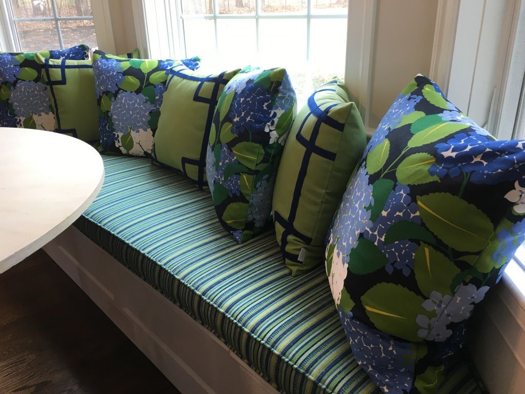
Coordinate throw pillows, rugs, and wall art with drapery colors to create a unified look. This works especially well in open-concept layouts.
Consider Room Function
- Living rooms benefit from warm, inviting tones
- Bedrooms often need restful, darker blackout drapery
- Dining rooms can handle richer colors for a formal feel
If you’re planning to refresh your window treatments based on your room’s function, it helps to know
where to buy drapery fabric locally so you can see color and texture options in person. This allows you to feel the weight of the fabric, compare undertones in different lighting, and make a more informed choice for your space.
The Don'ts of Mixing Drapery Colors
Avoid Clashing Undertones and Misaligned Patterns
A cool-toned gray with a warm beige rarely looks cohesive. When using patterns, ensure they share at least one common color.
Don’t Overuse Too Many Colors or Prints
More than two drapery colors often feels chaotic. Keep prints limited to one main pattern, supported by solids or subtle textures.
Don’t Ignore Lighting and Fabric Sheerness
Natural light affects how colors appear. Sheer fabrics lighten the perceived color, while blackout fabrics intensify it.
Skip Mismatched Hardware and Rod Finishes
Even the best color combination will fall flat if your drapery rods clash with the style or finish of your fixtures.
Don’t Add Layers Without Purpose
Every drapery layer should serve a role: light control, privacy, or decoration. Avoid adding fabric only for the sake of more color.
Room-by-Room Color Combination Examples
Living Room: Neutral Base with Jewel Tone Accents
- Base: Warm beige walls
- Drapery: Cream sheers with emerald green panels
- Accents: Green throw pillows, brass hardware
Bedroom: Light Sheers with Dark Blackout Panels
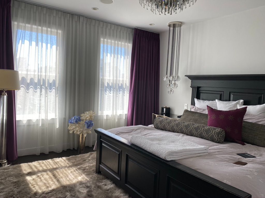
- Base: Soft gray walls
- Drapery: White sheers under blackout curtains
- Accents: Burgundy and white bedding
Dining Room: Two-Tone Drapery
- Base: Light taupe walls
- Drapery: Dual panels in taupe and pattern
Small Room: Monochromatic Layering
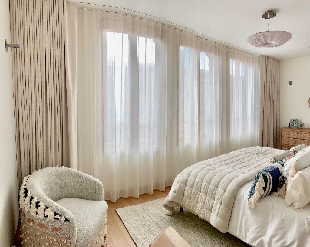
- Base: Soft off-white walls
- Drapery: Sheer white under soft cream panels
- Accents: Minimal patterns to keep space open
Step-by-Step Quick Guide: Do’s and Don’ts
Do:
- Choose a cohesive palette
- Use one dominant and one accent color
- Match accessories to drapery colors
- Consider lighting and room function
- Layer textures for depth
Don’t:
- Mix clashing undertones
- Overload with multiple patterns
- Ignore hardware finishes
- Use colors that fight against your existing decor
- Add unnecessary layers
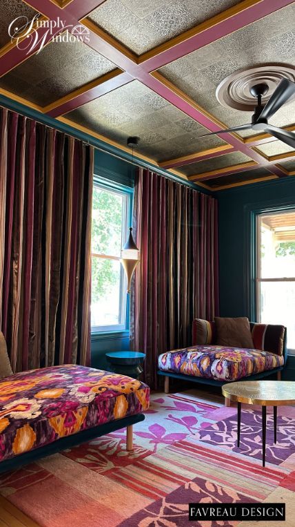
Trends and Forward-Looking Tips
Simply Windows observes that more homeowners are experimenting with bold patterns but balancing them with solid, grounding colors. Neutrals remain popular as base tones, while jewel tones and deep earth shades appear as accents. Looking forward, layered drapery in tonal variations is likely to remain in style, especially for open-plan homes.